Graphic Design
Most Representative Tools
My main tools while I design

Illustrator
Vector and Typogrphies Design.
Posters and Banners Layout.

Photoshop
Color Correction.

Figma
UX Design and Application Mock-ups

Overflow
Organized display of
the flow and look of UX Designs.
Covers
Music Artworks
Photoshop | After Effects | Cinema 4D - 2023 | 2024
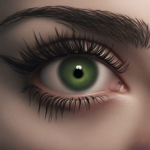
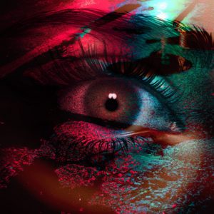
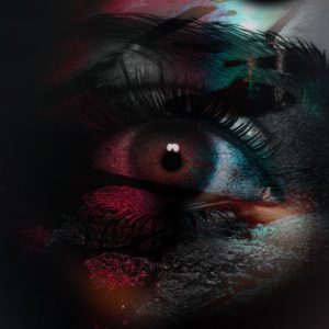
Every time an artist releases a new track, it’s accompanied by a cover art that visually represents it. In this particular case, I was tasked with creating cover art for Hard Dance music, where the aim was to convey emotions like pain and submission, which are themes of the track.
I worked with an AI to create the base of an open eye. Then, I utilized techniques such as masks, blending layers, and shadows to craft the final artwork, ensuring it effectively conveyed the desired emotions and message.
In addition other advanced software programs were employed to create additional ‘Artworks’, further enriching the creative process. These included Adobe After Effects for visual effects, Cinema 4D for 3D modeling, and Runway for innovative AI-driven content generation. Each tool brought unique capabilities to the table, enabling the creation of visually stunning and conceptually diverse pieces that pushed the boundaries of creativity. Together, these tools allowed me to create different versions of each ‘Artwork’, trying to achieve the desired design, style, and composition that brings the feeling of the track to an image.
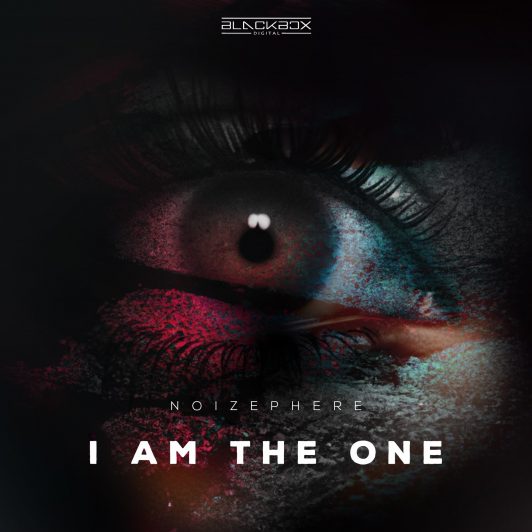


In addition, vertical and wallpaper versions of these artworks were also created to serve a variety of purposes, including use on social media platforms or as miniature previews for video clips, ensuring versatility and alignment with diverse digital and visual content needs.


BANNERS
Poster Design
2016 - 2021
Photoshop | Illustrator
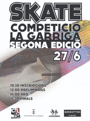
I've been involved in numerous events and projects where my role was to design posters for advertising and marketing purposes. These projects have been quite diverse. In some instances, I collaborated with the City Hall, focusing on attracting a younger audience. In other cases, I partnered with specific companies to figure out the most effective strategies for showcasing their products or services and reaching their intended audience.
POP
2021
Photoshop | Illustrator
I was tasked with a project to design a 2-meter tall Roll-Up banner for a trade fair. The company POP had specific guidelines they wanted me to adhere to during the creation process. My proficiency in Illustrator and Photoshop, made possible to successfully meet their requirements and complete the project.
In this particular instance, the company gave me an initial concept created using a basic tool like "Paint." I then took their concept and information and transformed it into a polished and sophisticated design that looked professional and clean.
This Roll-Up project had a "Clinical" theme so I opted for a design approach that was familiar and friendly where the information provided about how to use the mask was presented in a clear and well-organized manner.


POP
2021
Photoshop | Illustrator
I was tasked with a project to design a 2 meter tall Roll-Up banner for a trade fair. The company POP had specific guidelines they wanted me to adhere to during the creation process. My proficiency in Illustrator and Photoshop, made possible to successfully meet their requirements and complete the project.
In this particular instance, the company gave me an initial concept created using a basic tool like "Paint." I then took their concept and information and transformed it into a polished and sophisticated design that looked professional and clean.
This Roll-Up project had a "Clinical" theme so I opted for a design approach that was familiar and friendly where the information provided about how to use the mask was presented in a clear and well-organized manner.


Twitch Channel Assets
2021
Photoshop | Illustrator | Cinema 4D
Twitch Channel Assets
2021
Photoshop | Illustrator | Cinema 4D
The primary platform for live video streaming has been experiencing significant growth recently. In response, streamers approached me for my expertise in graphic design. They sought my assistance in developing visual materials that would elevate their brand and give them a more professional image as streamers.
The primary platform for live video streaming has been experiencing significant growth recently. In response, streamers approached me for my expertise in graphic design. They sought my assistance in developing visual materials that would elevate their brand and give them a more professional image as streamers.
Noizephere Assets
Twitch Harddance Music Production Streamer

Twitch Offline Banner
For Twitch streamers, several key visual elements are essential. One of these is the banners, which serve to indicate whether the streamer is offline, about to start a stream, or ending one, all while maintaining their unique visual identity. In the case of Noizephere, a Hard Dance music producer, I crafted a distinctive 3D skull icon (using Cinema 4D) and a 2D version (created in Adobe Illustrator) to serve as an iconic representation during his livestreams.
Equally significant are the panels that provide channel descriptions, and in this case, I drew inspiration from the panels commonly used on the Twitch platform. However, I added a Noizephere twist to infuse his brand identity into the designs.


Panels

Emotes
Lastly, one of the crucial elements for streamers is the creation of emotes. These are icons that subscribers can use in the chat, and since the channel revolves around Hard Dance Music, I designed pixel art icons featuring prominent Hard Dance Festival logos.
For Twitch streamers, several key visual elements are essential. One of these is the banners, which serve to indicate whether the streamer is offline, about to start a stream, or ending one, all while maintaining their unique visual identity. In the case of Noizephere, a Hard Dance music producer, I crafted a distinctive 3D skull icon (using Cinema 4D) and a 2D version (created in Adobe Illustrator) to serve as an iconic representation during his livestreams.

Twitch Offline Banner
Equally significant are the panels that provide channel descriptions, and in this case, I drew inspiration from the panels commonly used on the Twitch platform. However, I added a Noizephere twist to infuse his brand identity into the designs.


Panels
Lastly, one of the crucial elements for streamers is the creation of emotes. These are icons that subscribers can use in the chat, and since the channel revolves around Hard Dance Music, I designed pixel art icons featuring prominent Hard Dance Festival logos.

Emotes
Lanit Assets
Twitch Videogames Streamer
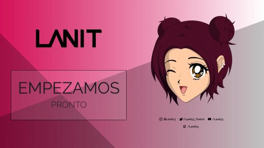
LANIT's visual elements primarily centered around the colors pink and white. To build her brand, I embarked on the task of creating LANIT as an Anime Character entirely from scratch using Adobe Illustrator. This character became an iconic figure during her livestreams and was incorporated into her banners, panels, and emotes.
Twitch Starting Banner


Panels


In addition to the character, I introduced a design element that involved lines that intersected with the background color. This design choice aimed to create a cleaner and more visually engaging look. The intersection points of these lines were strategically positioned to draw attention to the message conveyed in the banners or panels.
Regarding the emotes, LANIT had specific ideas in mind. These emotes are typically simple images that subscribers can use in the chat, and LANIT's ideas revolved around experiences and events that had taken place within her community.

Emotes
LANIT's visual elements primarily centered around the colors pink and white. To build her brand, I embarked on the task of creating LANIT as an Anime Character entirely from scratch using Adobe Illustrator. This character became an iconic figure during her livestreams and was incorporated into her banners, panels, and emotes.

Twitch Starting Banner
In addition to the character, I introduced a design element that involved lines that intersected with the background color. This design choice aimed to create a cleaner and more visually engaging look. The intersection points of these lines were strategically positioned to draw attention to the message conveyed in the banners or panels.


Panels
Regarding the emotes, LANIT had specific ideas in mind. These emotes are typically simple images that subscribers can use in the chat, and LANIT's ideas revolved around experiences and events that had taken place within her community.

Emotes
UX UI DESIGN
DOULA App ReDesign
Illustrator | Figma | Overflow - 2023
I contributed to the improvement of Doula, an application designed to provide guidance and support to pregnant individuals throughout their pregnancy journey and its various stages.
(This was an assessment for a UX/UI Design Job)
Pregnancy Guides
To enhance the existing app, I realized that the overall visual branding didn't effectively convey the emotions and comfort that a pregnancy app should. In my view, it should be welcoming and user-friendly, with simplicity to ease the challenges of pregnancy. This is why I decided to redesign the logo.
Home
Splash
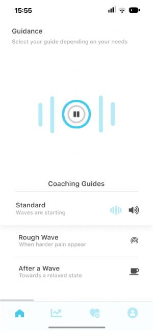
Home (First guide activated)
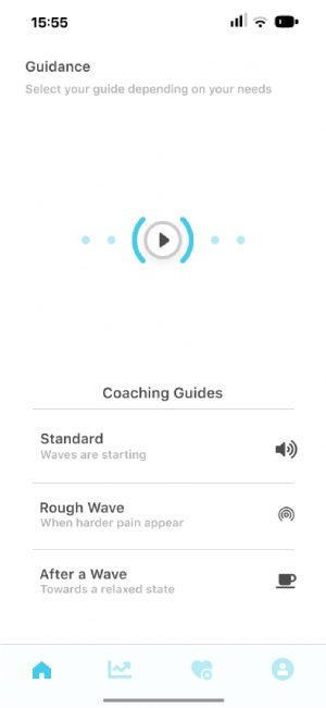
The entire user interface received a complete overhaul. I aimed to make it simpler and more organized, striving for a balance between a medical feel and a user-friendly, comfortable design. Additionally, I updated all the main concepts to ensure that the guides and information were easily comprehensible for the users.
Symptom Tracker
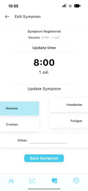
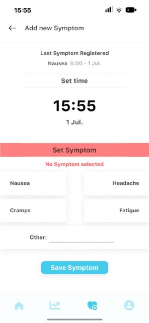
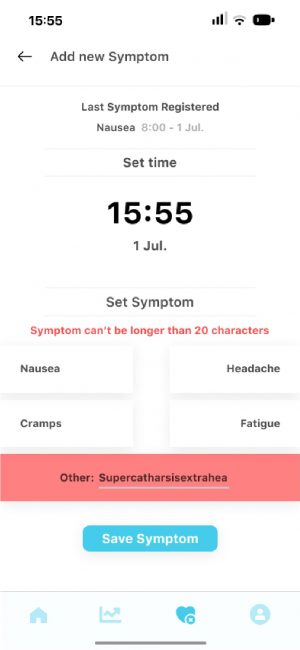
In addition, I introduced a fresh feature known as the symptom tracker. Its purpose is to allow users to monitor and record the symptoms they experience, as well as the times when these symptoms occur. This way, we can gain valuable insights into how their symptoms change and develop over time.
Symptom Tracker
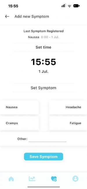
Add Symptom
Tracker Insights
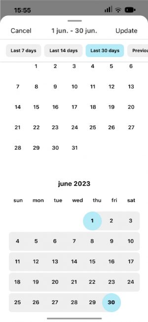
Select Month
When I was creating the features for the Symptom Tracker, I anticipated the various situations that might arise, such as instances where there's no information, errors, or successfully saved symptoms. In response, I developed the design elements to accommodate and address these different states.


BRANDING
2021
Photoshop | Illustrator
Logo Design
Ensuring the proper conveyance of the desired emotions or messages that a brand wishes to communicate to the global audience is a must, while also aligning with the preferences and choices of customers.
The complexity of harmonizing the personality of a brand with the concepts and ideas envisioned by the client has led me to engage in demanding projects. These projects aim to guarantee that the brand effectively communicates its intended identity and values.
BRANDING
Logo Design
2021
Photoshop | Illustrator
Ensuring the proper conveyance of the desired emotions or messages that a brand wishes to communicate to the global audience is a must, while also aligning with the preferences and choices of customers.
The complexity of harmonizing the personality of a brand with the concepts and ideas envisioned by the client has led me to engage in demanding projects. These projects aim to guarantee that the brand effectively communicates its intended identity and values.

ALEXO BALBONI
Alexo Balboni is a Tech House DJ hailing from Malaga, Spain. His logo underwent a transformation by revamping an older version.
The modifications were made in alignment with the type of music he specializes in and the image he conveys. The objective was to create a logo that's welcoming yet imbued with personality, featuring curvaceous elements alongside a refined typography.


NOIZEPHERE

Noizephere is a Hard Dance Music Producer and DJ from Barcelona, Spain. His logo was crafted entirely from the ground up, with a brand-new typography designed from scratch.
The primary aim was to develop a logo that exuded a sense of cleanliness and approachability, inspired by the DJ's personality and the melodic aspects of his music. Yet, to add a touch of intensity, certain letters were intentionally distressed, featuring scratches that simulated a handmade, slightly aggressive typographic style.
Following the completion of the initial design, the next challenge was to create an Isotype that would harmonize with the existing Logotype, maintaining the same aesthetic and emotional resonance. This required a careful approach to ensure that the Isotype embodied the same style, mood, and essence that the main Logotype conveyed, serving as a complementary yet distinctive visual element. Through meticulous design iterations and a deep focus on alignment with the brand's identity, the final Isotype successfully achieved the intended goal.


Noizephere is a Hard Dance Music Producer and DJ from Barcelona, Spain. His logo was crafted entirely from the ground up, with a brand-new typography designed from scratch.
The primary aim was to develop a logo that exuded a sense of cleanliness and approachability, inspired by the DJ's personality and the melodic aspects of his music. Yet, to add a touch of intensity, certain letters were intentionally distressed, featuring scratches that simulated a handmade, slightly aggressive typographic style.

Following the completion of the initial design, the next challenge was to create an Isotype that would harmonize with the existing Logotype, maintaining the same aesthetic and emotional resonance. This required a careful approach to ensure that the Isotype embodied the same style, mood, and essence that the main Logotype conveyed, serving as a complementary yet distinctive visual element. Through meticulous design iterations and a deep focus on alignment with the brand's identity, the final Isotype successfully achieved the intended goal.


HOLISTICA CV
Holistica CV is a platform dedicated to the sale of meditation-related materials. The core of the logo centers around a star-shaped design, which resembles the sacred Merkaba shape associated with meditation.
Since the brand's goal is to convey a sense of inner connection and harmony with the world, I aimed for a design that is clean, featuring straightforward typography and a welcoming and engaging appearance. The intention was to create a visual identity that resonates with the feeling of peace and self-connection.


LANIT

LANIT is a Twitch live streamer from Spain, specializing in video games.
Her personal style blends sweetness with gothic elements, creating a unique vibe. That's why, in this instance, the typography is intentionally designed to strike a balance - it's simple and approachable yet with a hint of edginess, incorporating subtle curves in the shapes without going overboard. The aim was to create a logo that conveys a sense of intrigue and depth without fully revealing its message, mirroring LANIT's distinct style.


JOSU IAM
LANIT (Twitch Streamer)
